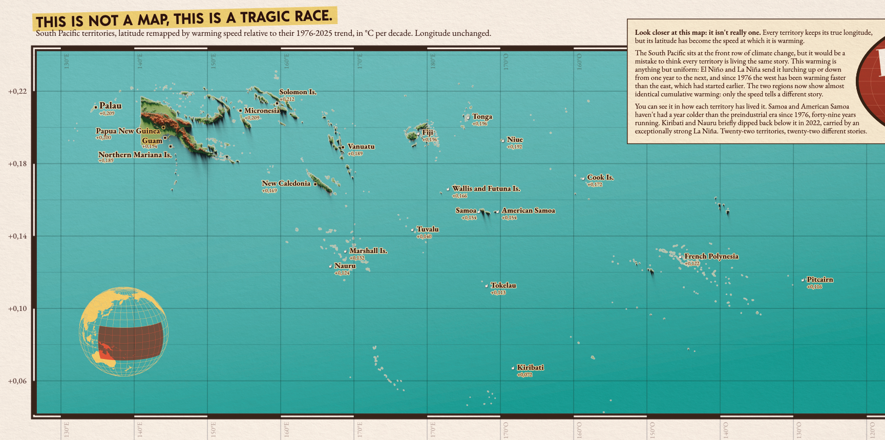
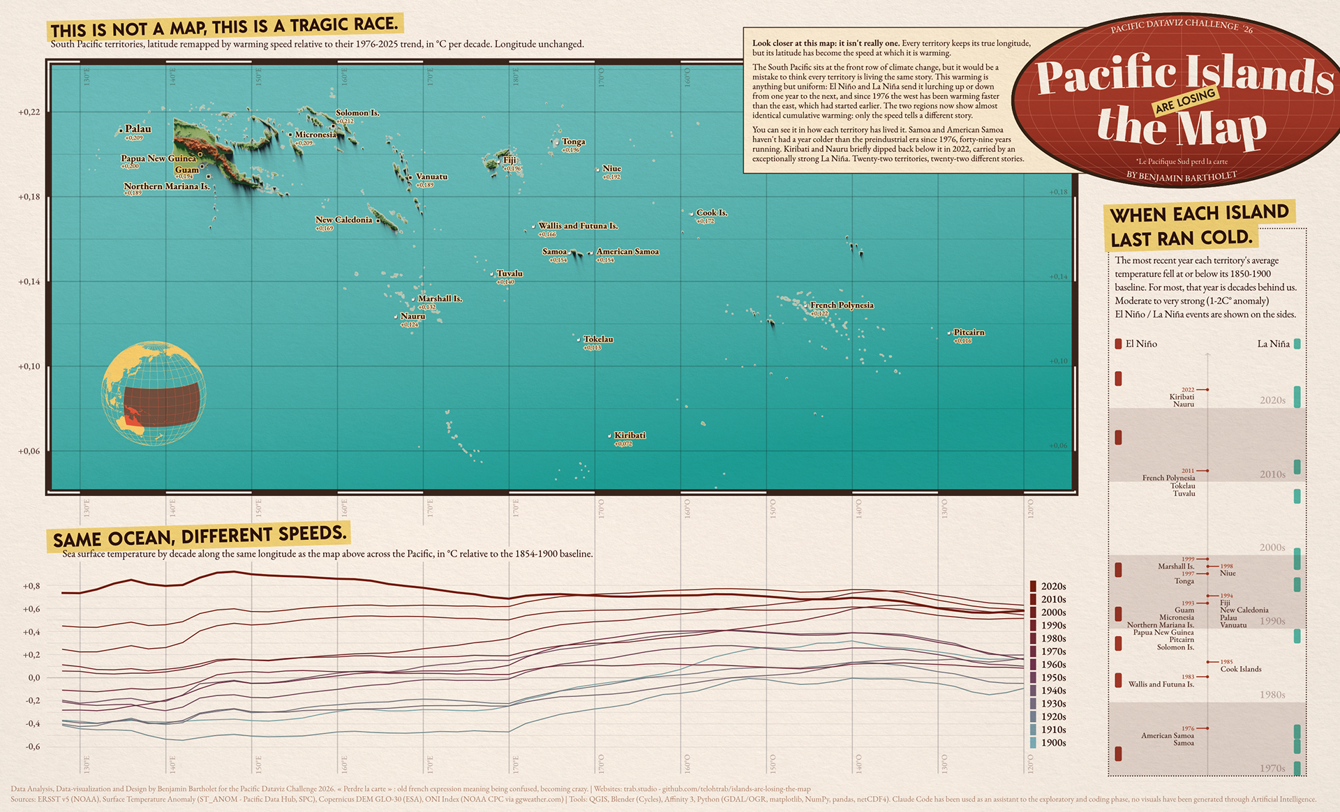
Palau's ocean warms at +0.209°C per decade. Kiribati's warms at +0.072, nearly three times slower, in the same ocean. Standard warming maps erase that gap and tell one story: the ocean is warming. Twenty-two Pacific territories tell twenty-two different ones.
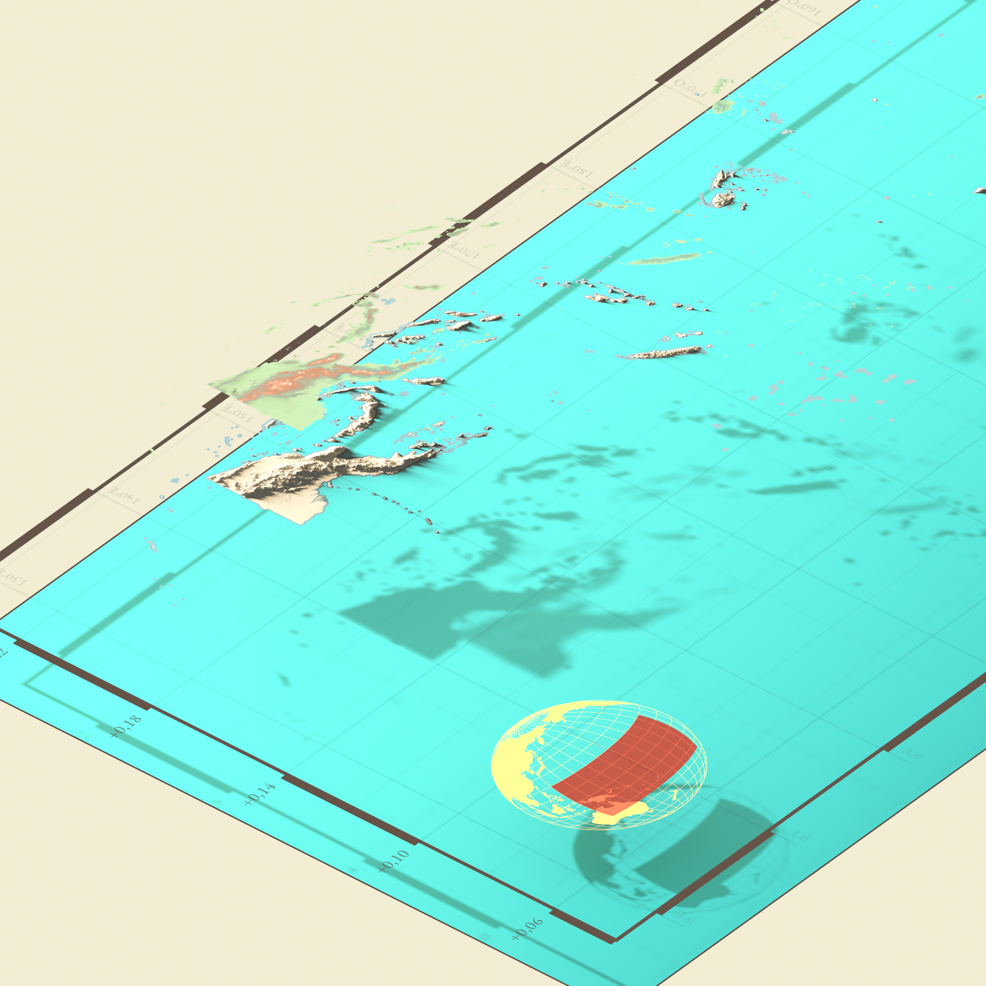
Pacific Islands Are Losing the Map takes that hidden variable and turns it into geography. Each of the 22 territories keeps its true longitude, but its position on the vertical axis stops being latitude and becomes warming speed instead (1976-2025, °C per decade). Territories that warm faster rise toward the top of the map, slower ones sink toward the bottom, no legend standing between the reader and the claim.
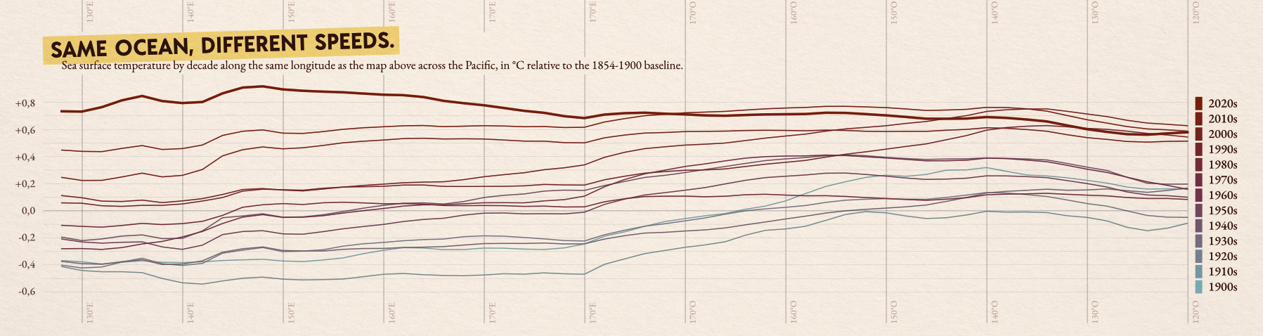
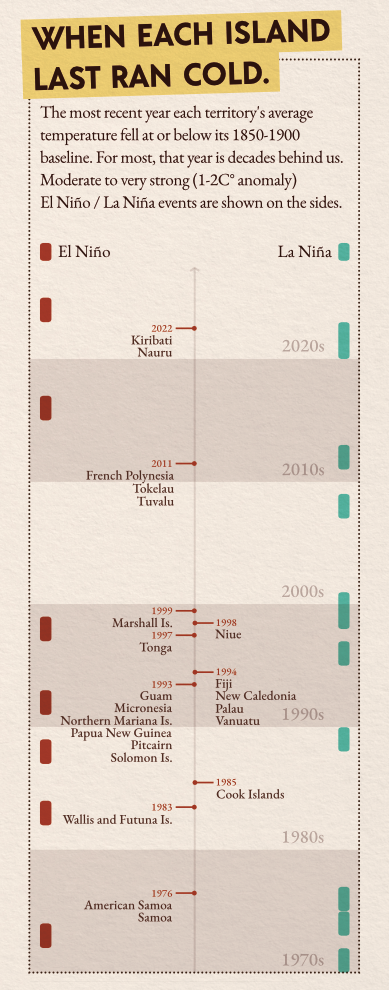
Two panels back up that repositioning with longer evidence. A decade-by-decade sea surface temperature chart, aligned to the map's own longitude axis, tracks the west overtaking the east in warming speed since the mid-1970s, after the east warmed first and then slowed. A second panel follows the last year each territory ran colder than its preindustrial baseline: 1976 for Samoa, 2022 for Kiribati and Nauru, a forty-six year gap between two coastlines a few thousand kilometers apart. El Niño and La Niña events sit next to that timeline, explaining why a handful of territories held out so long.
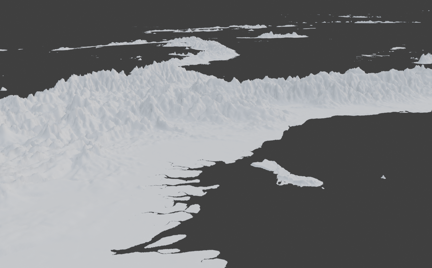
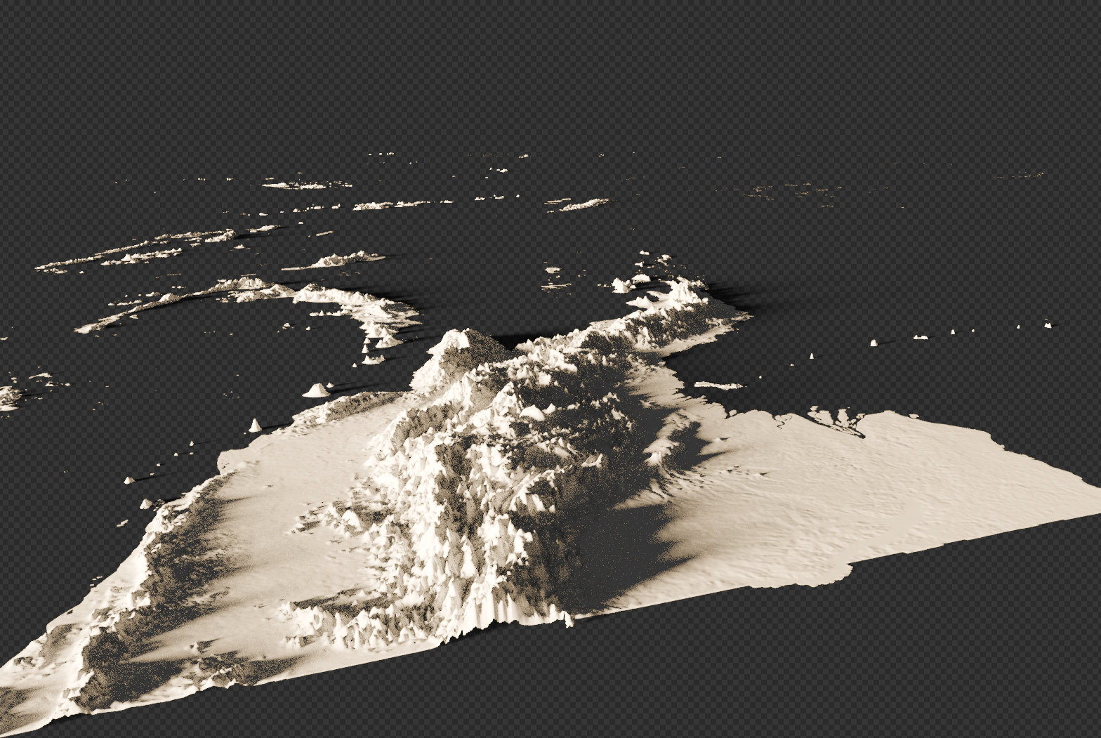
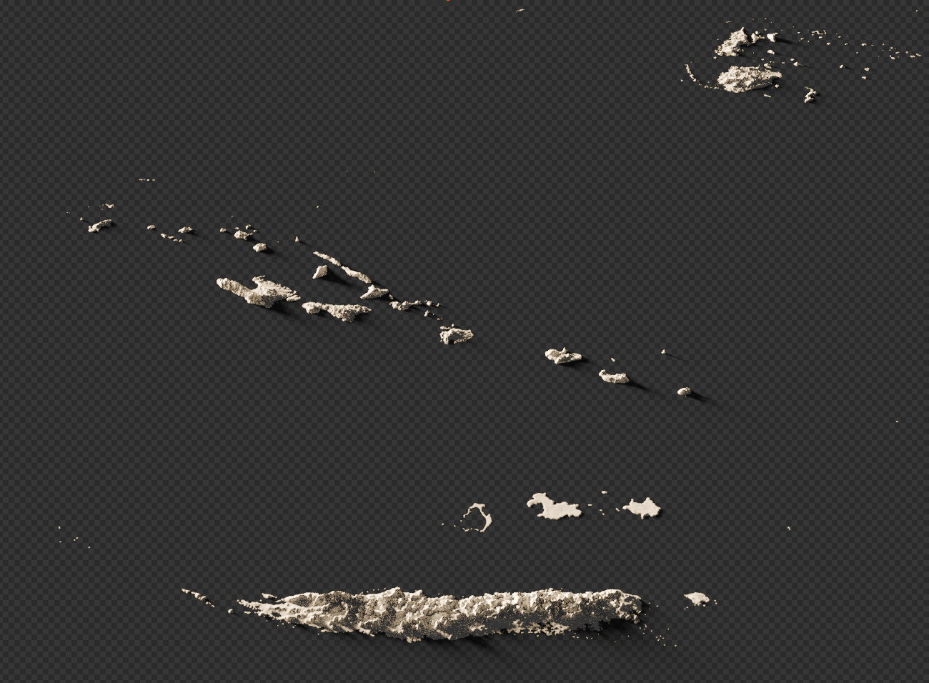
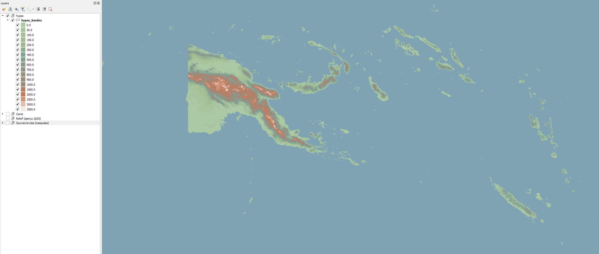
The piece sits between two eras on purpose. Clean modern typography and a tight grid carry the data, while an oval cartouche, a hypsometric color palette and a paper-grain background pull from nineteenth-century atlases. The relief comes from a non-photorealistic Blender render built on real Copernicus elevation data, each territory physically displaced from its true position to its climate one, in both the map and the terrain.
Submitted to the Pacific Dataviz Challenge 2026, organised by the Pacific Community.
Year: 2026
Data source: Pacific Data Hub (ST_ANOM), ERSST v5 (NOAA), Copernicus DEM GLO-30 (ESA), ONI Index (NOAA CPC)
Tools: QGIS, Blender, Affinity Designer, Python, Claude Code
Code: github.com/telohtrab/islands-are-losing-the-map
Code: github.com/telohtrab/islands-are-losing-the-map